Project overview
The product
Ticketing app for a movie theater, that can help users buy tickets from a mobile app, a user also can reserve his seats, buy snacks, and reserve a place in parking for his car
Project duration
01/01/2023 to 01/07/2023
The problem
Staying in line for a long period to buy a ticket in a movie theatre with a risk of ticket going sold out. The white video-on-demand over-the-top streaming service online solutions like Netflix, decrease significantly the number of users to movie theatres.
The goal
Make the experience of going to the movie theatre easier, enjoyable and increase the number of users going to the movie theatre.
My role
UX designer an app for Ticketing app from conception to delivery.
Responsibilities
I conduct interviews, user research, paper and digital wireframing, low and high-fidelity prototyping, conducting usability studies, accounting for accessibility, and iterating on designs.
Understanding the user
User research
Summary
Conducted interviews and created empathy maps to understand the users I’m designing for their needs, A primary user group identified through research was working adults who want go to the movie theater with their kids or with friends.
This user group confirmed initial assumptions about movie theater customers, but research also revealed that time and waiting in line were not the only factors limiting users from going to movie theaters to watch movies.
Other user problems included obligation, interests, fear of tickets being sold out, or challenges that made it difficult to get groceries for cooking to go to the movie theater to watch a movie.
Pain points
- Time
- Accessibility
- Waiting in Line
- Ordering tickets
Time
Working users are too busy to spend time
Accessibility
Platforms for ordering tickets are not equipped with assistive technologies
Waiting in Line
Waiting in line takes lots of time and makes users frustrated from fear of not getting tickets
Ordering tickets
Most platforms just order tickets only and very difficult
Personas
Maya John
Problem statement:
Maya John is a mother of 3 kids who needs a app that can order and buy ticket because staying in a long time in line.
Maya John
Problem statement:
Kelly Stone is a intern at a marketing agency who needs order tickets from his smartphone because going the cinema with my friend .
User journey maps
A confront way to get into a movie theater without staging in line for long hours
Starting the design
Paper wireframes
Taking the time to draft iterations of each app screen on paper ensured that the elements that made it to digital wireframes would be well-suited to address user pain points. I prioritized a quick and easy ordering ti²cket process for the home screen to help users save time.
Digital wireframes
During the initial design phase, I ensured that the screen designs were based on feedback and findings from the user research.
Find the purchased tickets get access to the new ticket and modify easily the ticket order
Easy navigation was a key user need to address in the design in addition to equipping the app to work with assistive technologies
Low-fidelity prototype
The low-fidelity prototype connected the primary user flow of building and ordering ticketing for movie theaters so the prototype could be used in a usability study with users.
Tracketing app lo-fi Link
Usability studies
Findings
Round 1 findings
- Users need better cues and intuitive ways to scroll the screen
- Users need better cues and indications to find where to change their Ticket order
- Users need better indication and a clear way to inform users the modification order ticket is free
ROUND 2 FINDINGS
- I add more payment method
- I add more option to buy snacks
Refining the design
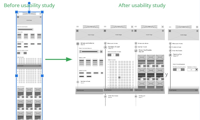
Early designs allowed for some customization, but after the usability studies, I added additional options to steps to choose movies, number of tickets, seats, snacks, and parking car. I also revised the design so users see all the customizations

Mockups
After a usability study, we found, that separating the new, old, and canceled tickets from one screen to separating with a tap makes it easy to distinguish from three states of tickets
High-fidelity prototype
After a usability study, we found, that separating the new, old, and canceled tickets from one screen to separate with a tap makes it easy to distinguish from three states of tickets
View the ticketing app Link

Accessibility
- Provided access to users who are vision impaired through adding alt text to images for screen readers
- Used detailed images for snakes and movies to help users better understand the designs
Going forward
Takeaways
Impact
The app makes users feel like the ticketing app thinks about meeting their needs One quote from peer feedback: “The app made me rediscover the new experience and enjoy watching a movie in a movie theater”
What I learned
While designing the ticking app, I learned that the first ideas for the app are only the beginning of the process. Usability studies and peer feedback influenced each iteration of app designs.
Next steps
- Conduct another round of usability studies to validate whether the pain points users experienced have been effectively addressed.
- Conduct more user research to determine any new areas of need.
