
Project overview
The product
The HostPoint is a app to plan the best location for new food banks site . The typical user is NGO’s managers, they want to plan and organize relief activities for helping people
Project duration
June 2023 to July 2023
The problem
NGO’s activities planner or food bank manager struggle to find places in emergency situation for making a relief operations, evene in normal day finding a place for food distribution is not easy
The goal
Design a hostPoint a website and app solution to be user friendly by providing clear navigation and offering a fast way to find and rent a place for food distributions and relief humanitarian operations
My role
UX designer an app for Ticketing app from conception to delivery.
Responsibilities
Conducting interviews, paper and digital wireframing, low and high-fidelity prototyping, conducting usability studies, accounting for accessibility, iterating on designs and responsive design.
Understanding the user
User research
Summary
I conducted user interviews, which I then turned into empathy maps to better understand the target user and their needs. I discovered that many target users need to find and rent a place for food bank and relief humanitarian operations for helping people in normal day and even emergency situation when the time play a major role. if they have easy access to available places for rent and are adapted for food bank and relief operations that can help gain a lot of time in this type of operations.
Pain points
- Time
- Accessibility
- Interaction
- Experience
- Navigation
TIME
During emergency and planning activity the time play a major factor for the success of the operation or activity
ACCESSIBILITY
Platforms for rent a places are not equipped with assistive technologies
Interaction
Rent place website designs are often busy, which results in confusing navigation
Experience
Looking for place like warehouse for rent is not a easy task and take time an engaging browsing experience
Personas
Maria Garcia
Problem statement:
Maria Garcia is a Community helper who needs to find a place for food distribution because they want to make easy access and ensure basic need food for her community.
Dave Smith
Problem statement:
Dave Smith is an asocial worker in NGO who needs to Find a warehouse to rent because he needs to make it a relief distribution point for the community after a storm hit the region
User journey maps
I created a user journey map of Dave’s experience using the site to help identify possible pain points and improvement opportunities.
Competitive audit
An audit of a few competitors’ products provided direction on gaps and opportunities to address with the food bank website.
Starting the design
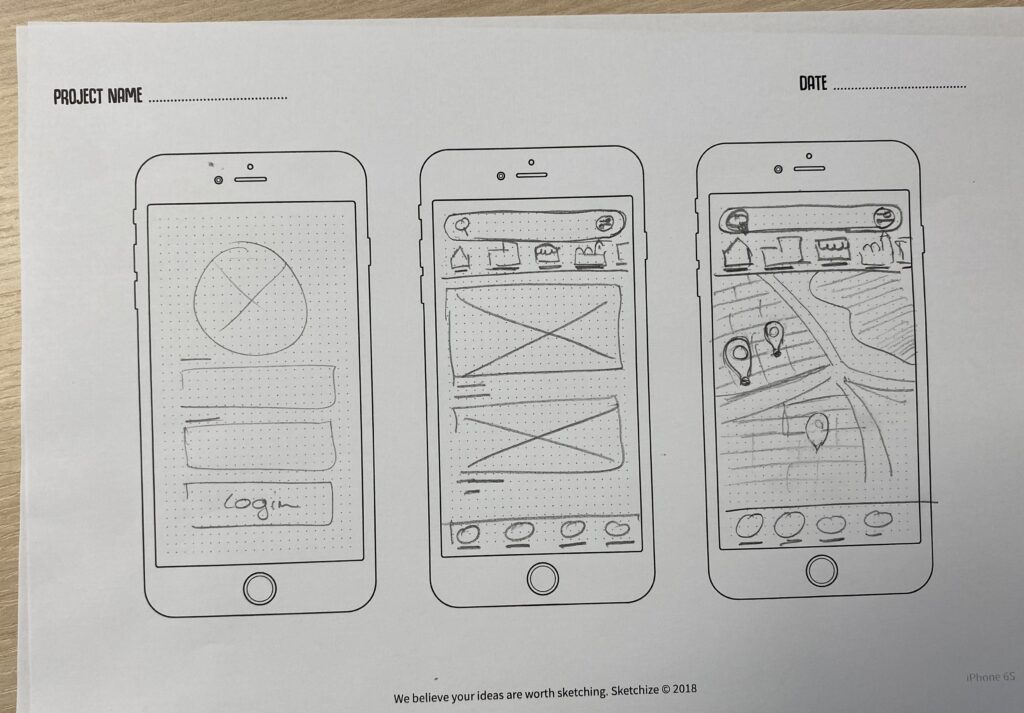
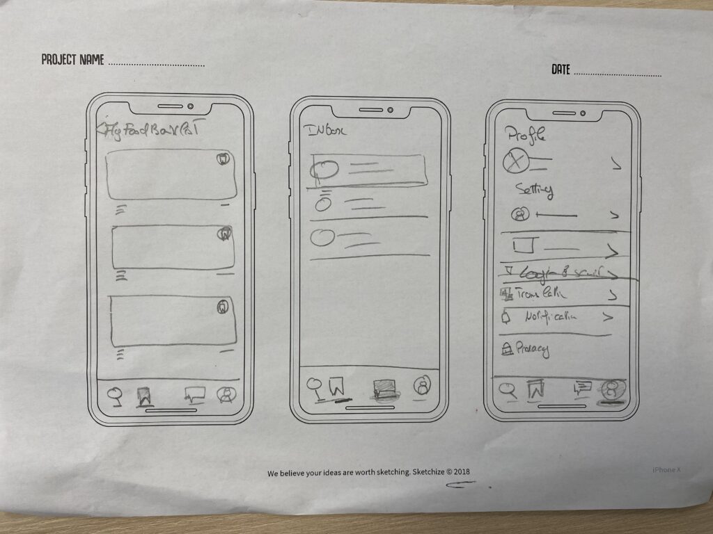
Paper wireframes
Taking the time to draft iterations of each screen of the app on paper ensured that the elements that made it to digital wireframes would be well-suited to address user pain points. For the home screen, I prioritized a quick and easy way to find a place for rent to help users save time.
Sitemap
Difficulty with website navigation was a primary pain point for users, so I used that knowledge to create a sitemap.
My goal here was to make strategic information architecture decisions that would improve overall website navigation. The structure I chose was designed to make things simple and easy.
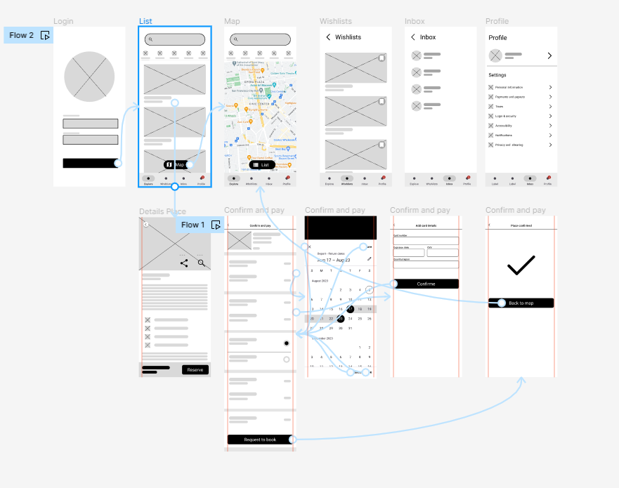
Digital wireframes
Moving from paper to digital wireframes made it easy to understand how the redesign could help address user pain points and improve the user experience.
Prioritizing useful button locations and visual element placement on the home page was a key part of my strategy
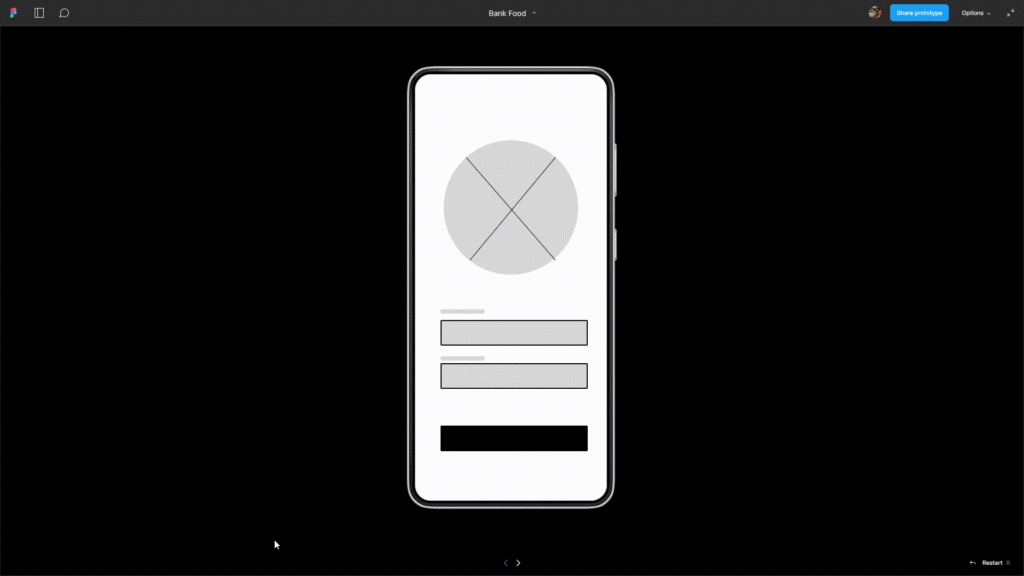
Low-fidelity prototype
The low-fidelity prototype connected the primary user flow of prioritized a quick and easy way to find a place for rent to so the prototype could be used in a usability study with users.
Tracking app lo-fi Link
Usability studies
Findings
ROUND 1 FINDINGS
- Users need better cues and intuitive ways to scroll the screen
- users need better cues and indications to find a warehouse to rent
- users need better indication and a clear way to inform users the modification of distribution places
ROUND 2 FINDINGS
- I add more payment method
- I add more option to buy snacks
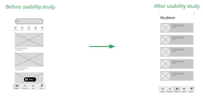
Refining the design
Based on the insights from the usability study, I made changes to improve the site’s signup flow. One of the changes I made was adding the progress barcustomizations
Mockups

High-fidelity prototype
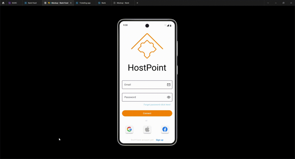
My hi-fi prototype followed the same user flow as the lo-fi prototype, and included the design changes made after the usability study, as well as several changes suggested by members of my team.
View the ticketing app Link
Accessibility
- Provided access to users who are vision impaired through adding alt text to images for screen readers
- Used detailed images for snakes and movies to help users better understand the designs
Going forward
Takeaways
Impact
Our target users shared that the design was intuitive to navigate through, more engaging with the images, and demonstrated a clear visual hierarchy.
What I learned
I learned that even a small design change can have a huge impact on the user experience. The most important takeaway for me is to always focus on the real needs of the user when coming up with design ideas and solutions.
Next steps
- Conduct another round of usability studies to validate whether the pain points users experienced have been effectively addressed.
- Conduct more user research to determine any new areas of need.
- Identify any additional areas of need and ideate on new features.
- Focus on mobile app solutions
